Ok I've got the embedding working on the page. After every class I'll upload the answers to the quiz (everyone did great on the most recent one, number 4, by the way).
Also I'd like to remind all of you to please email me if you have any questions or could use clarification on an assignment.
It's also important that you email me if you're having technical problems that will delay your submission of an assignment or if you're going to be absent or significantly late. This must be done before the class where the assignment is due or that you'll be missing or late for.
On one last note please remember that this blog is not solely for submitting assignments. If you have anything to share with the class (as long as it's relevant) or questions you want to pose to the whole class don't hesitate to post.
Thank you,
Lawrence B.
Thursday, February 28, 2013
Wednesday, February 27, 2013
Assignment #5 - Motion Graphics - Christian Tambling
Motion Graphics Proposal
The setting for my proposed piece will most likely be a sort of desolate, dystopian area somewhere in the future. Not sure how far into the future, but the feeling I will be trying to encompass or emulate will be a desolate, inhospitable area for human beings to live in. There will be a sort of vagabond like person traveling across the lands though. I would like to animate the sand and wind blowing by when he walks for a pretty interesting set of effects. I would also like to make the sun brighter, maybe a flare, than it actually is when he raises his head. Animations of the clouds passing by and other overcast would also be ideal.
I will most likely need props that fit the criteria of the setting such as environmental settings and stuff like that. Other than that, I won't really need many props (seeing as it won't really have much because of being a desolate futuristic setting).
Equipment required is pretty basic: camera adequate enough for shooting, tripod, maybe a mic setup of some kind.
Rough idea of the setting:
MG - Tommy O'Neil - Assignment 5 Proposal
Motion Graphics
Assignment 5 - Proposal
Assignment 5 - Proposal
I will be depicting Hell as my setting for this assignment. For footage, I will probably be using fire captured right from my wood stove. I may also shoot some footage outside during the night when it’s dark. For effects, I may use certain computer generated effects to depict restless souls and mystical demons floating around the evil-incarnated void.
I will probably be using my Newvicon tube video camera from 1984 to film the sequence, because older tube cameras have the comet-trailing effect with lights, which would look pretty neat to depict the essence of souls floating around.
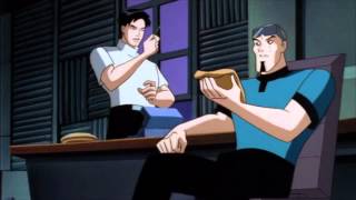
Assignment 4 - MannyJBad
I chose Star Trek (2009) which is a science fiction film that takes place in the extreme far off future. To accomplish its setting it uses lots of lighting effects and CGI of artistically rendered worlds and buildings.

 There is also the typical blinking lights that you typically think of when thinking of a futuristic film. In the spaceship it had lots of chrome, vivid colors and bright lights.
 And of course there is always coffee! Because everyone knows that even in the future there is always coffee! But besides the coffee you can see the facial make-up or cosmetics used to portray a different alien race for a final science fiction touch.


Assignment 4 - Kyle Dambowsky
Avengers
What does it depict that's impossible in reality?
 Well this movie has super-heroes and demi-gods running around fighting in a city and basically having most of it destroyed by the end i don't see that happening much. Also, as much as i would like, their is no way we have the power Armour/robotic sute that is iron man. The hulk is also as far as i know impossible the huge raging war machine has never been seen in reality

What visual effects does it use to accomplish this?
They used plenty of explosions and even a flying ship which most if not all weren't real but still looked amazing and felt larger then life. even some of the bad guys they had to overcome where bigger then some buildings they where fighting next to or over if they were flying!

What does it depict that's impossible in reality?
Well this movie has super-heroes and demi-gods running around fighting in a city and basically having most of it destroyed by the end i don't see that happening much. Also, as much as i would like, their is no way we have the power Armour/robotic sute that is iron man. The hulk is also as far as i know impossible the huge raging war machine has never been seen in reality What visual effects does it use to accomplish this?
They used plenty of explosions and even a flying ship which most if not all weren't real but still looked amazing and felt larger then life. even some of the bad guys they had to overcome where bigger then some buildings they where fighting next to or over if they were flying!

Why these effects?
I think they used these effects to really convey how powerful some of the characters are and to do a real over the top action to get the audience into the action.
Assignent 4 MOTGRPH
Motion Graphics Assignment 4
Avatar
"What does it depict that's impossible in reality?"
It depicts the possibility of humans discovering a new planet that has life. And the world they find is not only beautiful and strange but it also holds a type of rock (energy source) that is priceless and could fuel earths dying planet with endless amounts of energy. This is a real-life current problem, and the story brings in the audience by using the connection between our world and this imaginary movie one.
"What visual effects does it use to accomplish this?"
Visual effects that are used to accomplish this is: new, shiny technology such as spaceships, aliens, the way the night sky stars are generated, weapons, robots, and setting. A futuristic look where objects like spaceships, planes and buildings on Pandora are made of smooth textures. Pandora its self is a massive visual effect, where the plant life is different colors like blue, pink, yellow, and they all have a fibrotic glow to them. When the people walk on the ground of Pandora the grown glows with each step you make, and anything you touch glows brighter. It all around makes it seem like earth with more rainforests, substance and primitive nature which is believable to the audience and helps bring them in.
"Why these effects?"
I think they used these color schemes and effects similar to what you would find in the real world (earth) because it makes it seem possible. The futuristic technology and the advances in science all is probable because of what we can do today. The look of these ships, the fact that in the future you can now have your own avatar grown in a tube and connects to your body by neurons it maybe possible from what we know of science today. These effects captured the audience and brought them into a world that looks similar to the one they live in now.
A bunch of assignments
Here is a few assignments that I had created but had trouble posting.


Dig Vid Pro 2
Karolina Wojtysko
Assignment 1
Analyzing A Film
Title: Hunger Games
Director: Gary Ross
Type of Film: Action/Adventure
Released 2012
The shot sequence I watched was not too far from the begging where Katnis volunteers herself for the hunger games. The effects used were pretty simple and subtle. The effects of the shot really concentrated on the scenes background. A poor district with run-down buildings, repeating colors of grays and blues signifying sadness or struggle, the actors all playing unhappy distressed people. The way the location looks and the look on the people’s faces connects with the audience and helps bring them into the story. I believe the whole movie was shot very well, using scenery to tell its story. These effects are very important because for example if the actors wore brightly colored shirts and the sun in the scene was shining bright making the shot look warm and vibrant, well that changes the tone of the film.
Title: Superhero Movie
Director: Craig Mazin
Type of Film: Action/Adventure/Comedy
Released 2008
The shot sequence I watched was when dragonfly (the superhero without the powers to fly) encounters a villain names hour glass for the first time. I found this movie to be terrible. The effects used the movie are very cheap, uninteresting, and borderline bad. The premise of the movie was to make fun of spiderman, and a bad job at it. In the fight scene, the angles they used were very repetitive, nothing special, and at one point in the shot they crossed the line of axis. To top it off the lighting was bad (shadows did not add up and faces were too dark at times), and at some points there was too much light. Also, continuity in the shot was thrown out the window where at one point the villain has removed his glove where in the next shot he was wearing it. Overall, the effects of the whole movie were not pleasing and they should hire a new light crew.
Assignment 2 Motion Graphics

Assignment 3 Motion Graphics

Assignment 2 Dig Vid Pro
Joshua Dansby - Video Assignment 4 - Original Sounds
Spyro The Dragon - PS1
-Class Project- Creat Your Own Sounds (Original)
Spyro The Dragon
1 Walking in snow - Dog walking in snow
2 Smash sign into snow - Fist crushing paper on desk
3 Monster roar - Hair dryer slowed down to 50%
4 Spyro flying - fast/jumping - Metal cookie tray being fanned fast
5 Water - Running water in sink with drain blocked
6 Spyro wings hovering - Fanning one subject notebook
7 Spyro walking - Dog walking on kitchen floor
8 Touch metal dragon platform - fork against bowl
9 Dragon emerging - Sliding computer mouse
10 Dragon emerging (break glass shell) - Silverware drawer being rattled
11 Monster being hit - Can hitting can
12 Getting diamonds - Shaking car keys
13 Spyro running - Metal Bar rattling against wooden desk
14 Spyro landing - Drop full water bottle against wooden table & person jumping on kitchen floor
Tuesday, February 26, 2013
Assignment #4 - Motion Graphics - Christian Tambling
Doctor Who - The Impossible Astronaut (CONTAINS POSSIBLE SPOILERS)
"What does it depict that's impossible in reality?"
It depicts the theory of time travel as true and that irregularities are present everywhere and should be viewed as fact. It also presents the idea that many things deemed fictitious are in fact real: astronaut emerging from a lake, other lifeforms present on earth aside from humankind, etc.
"What visual effects does it use to accomplish this?"
Visual effects that are/may be used are include: proper camera work (panning, proper framing, etc.) green screening, great set and enviornment setting. As well as 3D object rendering (the TARDIS) and other effects (the gun flare from the astronaut)
"Why these effects?"
I personally think that the effects used within the show help to draw the viewer into the Doctor's universe. Without them we would just have props. The show would be entertaining, but it would in no way be the same. The visual effects present in the series help to bring it to life in a way never before possible. The tale of the Doctor and his companions is all that more telling with the use of visual effects.
Sound Effects Assignment - Steve Karr
In which sound effects are made from household items.
-Steve Karr
Asuka Saunders Film Analysis #1
Asuka Saunders
Analyzing Film
DAT H226/Baker
2/14/13
Ip Man
Director: Raymond Chow
Date of Film: 2010
Type of Film: Action/drama Martial Arts
Camera Movements:
During the fight scene, the main character, Ip Man, is shot close up as the enemies draw closer to him. He bows and it zooms out. The next shot is a high angled shot, focusing on the entire dojo and the 10 Japanese martial artists surround him and get at a stance. As the fight goes on, the shots change from behind Ip Man as he hits a guy in front of him and changes from in front of Ip Man but still a back shot of the guy he takes down. As the other fighters try to move around him, the camera is still and focuses on Ip Man who is preparing to take down whoever comes forth.
Lighting Style:
Inside the dojo is very dark. However, the main stage, or the fighting matt is lightened and bright. Even though the center of the fight is bright, it is highly contrasted to blend into the dark background. I also noticed that the scene has a hint of a dark blue color. Although windows are visible, the light from the outside world does nothing to lighten up the arena.
Pace and style of editing
The pace and style is very fluent as most martial arts films are. (With the exception of the very jumpy Jackie Chan films.) However Ip Man is a very fast paced fighter and due to that nature, the camera remains still as he throws his rapid punches. The editing it seems as though the entire fight scene was shot in a one go and kept. If a man was lying on the floor, in other shots he remained in that spot. Maybe their goal was to get the entire fight in one try using many cameras. If not, they fooled me.
MGFX4 - Matthew Ashby
"What does this clip depict that is impossible?"
The idea that shared dreaming is accomplished with a machine and is honed as a skill set which can then be used for idea robbing or planting.
"What visual effects does it use?"
As an analogy for film creation, this clip of Inception uses jump cut editing, and 3d environmental rendering to create the illusion that the characters are in a dream and thus able to mentally control their surroundings.
"Why these effects?"
These effects create a sense of control even in the midst of the chaos, playing off the actress's performance to make it seem as if she is surprised that she is the cause of the explosions.
DVP4 - Matthew Ashby
Carving - Ruler rubbed against rubber ball
Gun cocking - Marker
Bone break - Pen Click
Door Slam - Pillow Case whip
Sandpaper - Ruler rubbed on hand
Sword draw - Ruler slide along ruler
Monday, February 25, 2013
Sound Create-Jordan Banks
My sounds:
Fire: plastic crumbled with scratching
banging on door:pencil hitting a empty box
barking:voice, banging on box, scratching and ripping paper
wind:scratching on box
magic:wind chimes, crumbling paper and scratching little on mouse pad
strike: stabbing box
roar:voice, crumbling paper, ripping paper, nail on box
music done by griffin Banks
Friday, February 22, 2013
Motion Graphics -- Interview/Lower Thirds Assignment
Here's my interview video. It uses animated lower thirds with an FCC stamp.
Thursday, February 21, 2013
Student Artwork Requested
Also Ray asked that I pass this message on to all of you:
Faculty, please announce to your students and yourselves:
Final notice! Submission Deadline Thursday 2/28
Note: Student awards!
Fresh Ink
Literary Journal
Call for Entries: HEY! WE WANT YOUR WORK!
POEMS-PROSE-FICTION-ESSAYS-
Fresh Ink invites writers and graphic/photo artists to submit their work for consideration in the
Spring 2013 issue.
SUBMISSION GUIDELINES:
What: previously unpublished pieces in three categories: poetry, prose, and graphic.
When: DEADLINE EXTENSION All entries must be received by Thursday, Feb 28, 2013 at 4:00pm
How Many: You may include a maximum total of five pieces, but with limits within each category: no more than three poems; no more than three prose pieces with a maximum total (cumulative) word count of 1200 words; and/or no more than three graphic submissions.
What Kind: Writing in ANY genre-poetry, fiction, short stories, excerpts, essay, micro. Art in any genre that can be formatted electronically for print, color or black and white. However, art will be evaluated with consideration for its reproduction quality.
HOW: All submissions should be sent electronically to Greg Harding at Freshink@nvcc.commnet.edu. Please format the email as follows: In the body of the email, include your name, address, telephone number, email address, and the title(s) of your piece(s). NVCC students must also submit student ID number to be eligible for awards. Each item should be submitted as a separately attached file. All file names should match your titles. Text files should be in Word or Rich Text format. Graphic files should be in hi-res jpg format. Do not include any contact or personal information in the attached documents. Improperly formatted submissions may be rejected.
WHY: All graphic submission will be considered for our cover competition. And current NVCC students are eligible for 1st, 2nd, and 3rd place awards in each of the three categories that include cash value prizes. Published authors will be paid in copies. One copy will be sent to each author, though more (up to 5) are available on request. Any author who submits work may also receive a free copy upon request.
Information/Contact: Greg Harding at freshink@nvcc.commnet.edu or 203-596-8763.
John Greg Harding
Assoc. Prof. of English
Naugatuck Valley Community College
jharding @nvcc.commnet.edu
Good news everyone!
Previous presentations are now up on the blog under the Presentations tab. Only the first 2 are up at the moment but the third one should be up before the end of the week.
Hopefully by the end of the week I'll have another section up under the "Handouts" tab: all the old quizzes marked with the correct answers for you to reference.
Hopefully by the end of the week I'll have another section up under the "Handouts" tab: all the old quizzes marked with the correct answers for you to reference.
Wednesday, February 20, 2013


MoGra - Carlos J Roldan - Lower Third


Tuesday, February 19, 2013
Wednesday, February 13, 2013
A2 "Graveskeep VS Taco Island!!" by Anthony Izzi


MoGra - Carlos J. Roldan - Assignment 2 - Title Card

short video #1(video 2 class)Jordan Banks
medium shot:
1)http://youtu.be/e_MLb6dgLeQ
2)http://youtu.be/hJ8YlNIjDYk
for the medium shots I would rather use shot 2 it is much more shadows and depth to give that over all feeling
wide shot:
1)http://youtu.be/yy9cwnAcmck
2)http://youtu.be/llpDl4skGyw
for the wide shots I would rather use shot 1 it give a sense of frame in because of the fence, I think this shot would be more effective even though the actors are very close to the center.
dolly shots:
1)http://youtu.be/FZ_nivppeQ8
2)http://youtu.be/rY8LZRFhqtI
for the dolly shots I would rather use shot 2 it makes the viewer almost tilt and feel uneasy making them go into the story line
Wednesday, February 13, 2013
Video Project 1 - Types of Shots - Joshua Dansby
(In Order of Appearance)
MCU (Medium Close Up)
Half way between a MS and a CU.
ECU (Extreme Close Up)
The ECU gets right in and shows extreme detail.
Cut-In
Shows some (other) part of the subject in detail.
JD
Video 2 Assignment #2 - Evan Sizemore
Video 2 Assignment #2
The shots include two medium shots, two close up shots, and two extreme close ups.
Tuesday, February 12, 2013
Short Video 1 - Steve Karr
My short video for the shot composition assignment
In which a young woman makes breakfast.
The shots used were (in order from first to last) a wide establishing shot of the kitchen, a medium tracking shot, a close up in the fridge, another medium tracking shot, another close up, and finally an extreme close up.
-Steve Karr
MoGra - Carlos J. Roldan - Analysis Assignment: Ultraviolet & Jumanji
Ok I'm not movie buff, so I rarely watch any movies, and even when I do I just accept what I watch no matter how bad it is. I'm more interested in the story content of a movie, but I digress. My assignment was to analyze two major motion pictures and pick one shot sequence that is an example of good special effects as well as one that is an example of bad special effect.
First movie was Ultraviolet, an action packed movie based off a comic series. Seeing as it is a "superhero" movie its relies heavilly on its special effects. Some of them pretty bad and other ones pretty stunning. However, the special effect that caught my eye is like something most people over looked or didn't really care much about. It was subtle change of wardrobe color. These scenes are sprinkled through out the movie. One minute Violet's wearing a pure white outfit next minute she's wearing blood red. Something like this is subtle and in my opinion is a nice touch of special effects.
Now is it believable in context to the film's world? Despite being subtle, it is believable. The movie's setting is modern-ish with a futuristic flare so the " phasing color " wardrobe, the bracelets that produce endless ammunition and weapons, right down to the container housing a child who is literally a bio weapon.
Now the effect of phasing the colors is subtle and is likely something people would overlook, so I believe it neither adds or detracts to the movie's story, theme, or characterization. Maybe that one scene where her outfit phases from white to red holds some effect to the Violet's characterization.
Was this Effect Essential? Now I've never read the comic , but if they had this "phasing" or "shifting" of color in it then it might of been essential just for the canon of the story. Otherwise its just something there to look interesting.
As I've mentioned before I believe the effect is subtle, its something that stands out on it own but it stands out just enough among the other elements.
Now we move on to the bad. Jumanji.
Now Jumanji wasn't bad movie. I personally liked it as a child, hell even wanted to buy the board game . However, the movie has an abundance of special effect that could use abit of remastering or in my opinion some rethinking. The scenes I'm talking about more specifically are the scenes where the cg animals are on screen. The stampede I can understand becuase who wants a bunch of of wild animals charging through city streets. The least they could do is polish up the cg to make it realistic. However thats just something small. No the largest sore thumb in this movie would be the scene where the monkeys are tearing up the kitchen. These are cg monkey and you can tell they aren't real either. This scene could have just used a trained monkey to make a mess.
Now it is believable in the context of the film's world, but honestly in context to the viewers perception its just horrid.
The Animal CG effects add to the movie's theme and story , because face the facts, just imagine watching Jumanji without the cg animals. It would be really awkward seeing Robin Williams running away from a stampede that isn't there, or see a tomato or knife flung for no reason at all. Even though they look horrid the cg is necessary to show the viewers that this board game is bringing the savannah and the jungle to the city, so yes it was essential, even though it could of been better.
The effects were definately grandiose, they stuck out in the movie and it was essential that it would do that so that, like I said, shows that the board game is bringing the savannah and the jungle to the city.
Wednesday, February 6, 2013
Analysis - Matthew Ashby
The Prestige is a film about the rivalry between two illusionists set in early 1900's England. The camera movements and lighting style throughout the entire film convey a sense of old time wonder, where the characters were living in an extraordinary time though to the audience it is history. A number of close up shots gave the impression that the audience was seeing even more clearly than the audience within the film, and so increased the tension of the surprise when the reveal came along. Furthermore, the theme of the film detailing the different acts within a magic trick (The Pledge, The Turn, and The Prestige) could be a larger sentiment on film making as well, and how films seek to 'trick' people into believing the unbelievable.
The effects within The Prestige are used very well to blur the lines between illusion, science and real magic. The audience is left wondering how these tricks are done and if the magicians have somehow tapped mystical power. The final reveal of science being a kind of 'real magic' is as shocking as it is gruesome, again displayed to great effect. The special effects within the film remain more on the subtle side, with explanation of the method of the tricks leading the audience to believe that though it is entertaining, there is still a basis in reality, which makes the finale all the more surprising even given the heavy handed foreshadowing. Adding to the characterization is done wonderfully with the effects, causing serious injury to both magicians when their apparatus malfunctions due to tampering. One could almost see this as a nod of respect for the people who do stunts and effects within productions, as evidenced by the Algier character taking his bow under the stage because of the requirements of the trick.
A similar film, The Illusionist, while excellent on it's own, becomes almost heavy handed with it's use of effects to convey that the magician is trying to sell himself as a being of supernatural power. While some of this is necessary to establish characterization and theme, there were some visuals the seemed to be the producers saying "Look at how cool this is!" While it didn't necessarily detract from the movie as a whole, it felt unneeded to further the film's pacing and ends up being a distracting trifle.
Both films are filled with wonder and surprise and despite their incredibly similar themes, tell two very different stories.
Assignment 2 - TechNews Title Card

-- Tom O'Neil
Batman Beyond – Season 1 Episode 07 - Shriek
Joshua Dansby
Title: Batman Beyond – Season 1 Episode 07 - Shriek
Director: Curt Geda
Date: 1999


What type of film is this?
The type of television show batman beyond is action, drama & mystery along with its cartoon animation visual style.
Literary Analysis of Film
Batman Beyond is a cartoon animation based on the original batman series but this time it is set fifty years in the future. Bruce Wayne (Batman) is in his late seventies not able to continue his role of batman and now passes his torch on to teen high school boy named Terry McGinnis. Terry just lost his father to the joker teenage gang. After saving Bruce from the joker gang that Terry unconscious led them to, Bruce finally agrees to let Terry become batman. The setting takes place still in Gotham City but this time fifty years in the future with hovering cars, AI robots, Credits (no more cash), splicing and a new suit upgrade which allows the new bat suit to fly, become invisible, ten times human strength; in addition to the new bat custom, Terry is equipped with a flying bat mobile. Under the training and assistance of Bruce Wayne young Terry should be a pro in no time!
Aesthetic Analysis of Film
Camera Angles: are CU sometimes tilted on a 45 degree angle representing danger something moving fast towards a character and the CU on the characters scared or surprised face. The episode starts off showing the character sitting down with a black background representing being in that characters mind, showing suspense. The camera was in WS creeping slowly to an ECU of the characters face and eyes only.
Camera shows a lot of zooming in and zooming out for character suspense. After showing a bright flashlight in the characters eye on a tilt 45 degree angle, the camera gets a MCU of the person’s hand holding turning off the flashlight at chest height.
On wide angle lens the camera shows a both of the men talking to each other WS including background than panning to the right slowly and the CU focus on a large stone while the character is saying the sound waves are so strong that it can shatter this rock from a distance while still focusing only on the rock than cut scene back to the two men than a CU on the one guys hand in an iron man suit warming up the machine disks in the palm getting ready to release the waves from his hand. The camera pans back to the rock right before it shatters at CU range.
The lighting is dark mostly focused on night time representing a sort of dreary setting.
The next scene is in a business office having a meeting that Bruce was conducting showing him at WS and then a CU of his face when he is talking and when he is getting ready to finish his sentence the camera zooms out showing WS view again then back to CU on one of the office members sitting down to show their face expressions in regarding to how they feel about what Bruce just addressed. The framing is loose showing the members leaving the room behind Bruce while he is centered on MCU. After the long meeting when Bruce is outside bout to get into the car with Terry the camera shows WS to show the building he got out with the limo in front the a CU of the driver side opening only CU on Terry the drivers legs than back to WS view showing Terry opening the back door for Bruce without the camera panning. At this point there is no music just the sound of cars going by just to indicate something is about to happen once the car starts moving or when the camera shows the next setting.
From these few scenes I enjoyed the mature calm moving of the characters along with the WS views showing lots of room disguising the cartoon television show as a real human actor movie.
William Battle Fight Club Movie Analysis

Fight is directed by David Fincher who also worked
on other masterful movies such as Se7en and The Curious Case of Benjamin
Button. Fight Club was released in 1999 just before the dawn of the 21 century,
and it’s a drama that makes you question how you live your life and changes
your perception.
The shot sequence I chose in this movie was one of the most
important parts in the movie: The start of Fight Club. It begins with a medium
dolly shot of Tyler’s back walking into the bar, the lighting is dark
attracting your eyes to the location itself, there are no cuts within the
scene, it’s still focusing on Tyler’s back until the next scene as he enters
the bar and then the camera moves to a medium shot of the bartender Irvin and
then the camera moves back into a medium shot of Tyler and Tyler (Ed Norton).
This scene is very gritty and gives you the view of a dark and grim movie. Then
we return back to a medium dolly shot of Irvin but even though Irvin is in the
front of the shot, your eyes are still focus on Tyler due to his appearance and
presence. The shot then turns into an establishing shot of all the men walking
towards the basement. The first cut comes in the next shot when they’re walking
down the basement stairs which turns into a wide angle dark shot of the whole
basement to give you a full look of one of the most important locations in the
whole movie, then that quickly cuts to the men walking in and getting ready for
what’s about the happen, then a close up shot of Tyler (Ed Norton) looking at
Tyler but the focus remains on Ed Norton, keeping Tyler at a blur. The next
shot continues with the men getting ready but then beautifully movies into a
medium dolly shot of Tyler giving the welcome to the members of Fight Club, as
soon as his says this, the lights turn on giving the movie clearly making even
more of a presence. The dolly shot continues until they cut to a close up of
Tyler’s face reinforcing the rules. The shots from there shows the men in Fight
Club getting ready for the fights in various details (such as a man taking off
his shoes and a close up shot of the back of a men’s pants as he is taking off
his belt) as the camera cuts back to Tyler continuing to give out the rules.
Tuesday, February 5, 2013
Analysis "Shark Attack 3: Megladon" & "Lord of War"
Shot Sequence Assignment 2/6/12
Bad Sequence
http://www.youtube.com/watch?v=1nzd0R_OeOc
-
- -The effects are not believable and are downright
embarrassing. The movie isn’t to be taken too seriously however the effects of
the scene are bad to the point of insulting to the viewer.
-
- Honestly there was no saving this movie so the
scene really just made the overall experience worse and now laughable.
-
- Well if you want to have a 60 foot megladon in a
movie called Shark Attack 3: Megladon then you need the effects to bring it to
life.
-
- Haha, most definitely grandiose. Sticks out like
a sore thumb on an already broken hand. Hard to miss a badly placed 60 foot dinosaur.
In closing, if you see this movie available
at your local rental store or on Netflix pass it up. Unless your life is need
of immediate humor. This movie makes me feel better about my ability to make
movies. It’s that bad.
Good Sequence

-
- Yes, immediately you feel as if you are part of
the bullets life cycle. The introduction by Nicholas Cage helps the beginning of
the bullet making scene flow flawlessly.
-
- It doesn’t necessarily add to the storyline it
does however give the introduction that “wow” factor and really pull you in
while also showing you the life of a bullet. That was however the purpose of
the intro. It was obviously a mix of 3D & After Effects/Final Cut.
-
- In my opinion trying to think of the movie
without this scene is difficult. It is widely known specifically just for this
opening scene. The designer should be very proud. So in my opinion, yes, it is
essential.
-
- Subtle, for the reasons above. It was flawless.
There weren’t any ridiculous effects it was just a perfectly done 3D sequence.
It looked as if the world’s smallest camera was a following this bullet. So it
did so much without displaying too much flash.
In closing, this is a very good
movie. It cracks my Top 100. This opening sequence had a moderately sized part
in deciding that. If you ever have the chance to watch and are interesting in
seeing how these “gun merchants” do business then “Lord of War” is second to
none. It also happens to be our previously professors favorite (or one of his favorite)
introductions in any major motion picture.
Subscribe to:
Posts (Atom)